
Basing News Categorization on Blog Blather
 Found this on Slashdot, but their headline—“Microsoft Developing News Sorting Based On Political Bias” made it sound a lot more interesting than it may be. The idea of mining text data to tease out mythical media biases and leanings sounds fascinating. What sort of axes could be determined? Could we see how different kinds of language are used, or ways that particular code words or phrases infect news coverage?
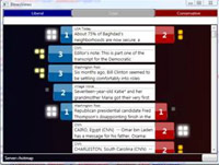
Unfortunately, the research project from Microsoft looks like it’s just procuring link counts from “liberal” and “conservative” blogs, and gauging the vigor of commentary on either side. Does this make you uneasy yet?
- We are politically binary: the world has devolved into conservative and liberal! (Or not, yet why do people insist on it?) The representation seems almost entirely U.S.-centric, right down to the red and blue coloring on either side. Red states! Blue states! Red blogs! Blue Blogs! A maleficent Dr. Seuss has infected our political outlook.
- What about those other axes, where are they? Of all the things to cull from political discourse, liberal vs. conservative must be one of the least interesting. Did you need a team of six from Microsoft, plus all the computing power at their disposal, to tell you that one article or another ruffled more feathers on either side of this simplified spectrum?
- There’s so much to be learned from propagation of phrases and ideas in the news; why hasn’t there been a more sophisticated representation of it? (Because it’s hard?) The Daily Show has shown this successfully (queueing several people in order repeating something like “axis of evil” or something about “momentum” for a candidate).
- Blogs are not real. When you turn off the computer, they go away. The internet is not a place, and is too divorced from actual reality to be a useful gauge on most social phenomena. Using blogs as input for a kind of meta-study seems like a poor way to acquire data.
The problems I cite are a bit unfair since they haven’t posted much on their site (looks like they’re presenting a paper…soon?) so the reaction is just based on what they’ve provided. I knew Sumit Basu back at the Media Lab and I think it’s safe to assume there’s more going on…
But what about these bigger issues?
