Writing

Glancing at Tax Proposals

Finally, the infographic I’ve been waiting for, the Washington Post compares the tax proposals of United States presidential candidates John McCain and Barack Obama:

graphic-halfsize.jpg

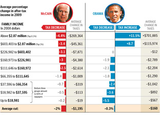
Lots of words have been spilled over the complexities of tax policy, whether in stump speeches, advertisements, or policy papers. But these are usually distilled for voters in lengthy articles that throw more words at the problem. But compare even a well-written article like this one at Business Week versus the graphic above from the Washington Post. Which of the two will you be able to remember tomorrow?

I also appreciate that the graphic very clearly represents the general tax policies of Republicans vs. Democrats, without showing bias toward either. The only thing that’s missing is a sense of how big each of the categories are – how many people are in the “over $2.87 million” category versus how many are in the “$66,000 to $112,000” category, which would help convey a better sense of the “middle class” term that candidates like to throw around.

There is still greater complexity to the debate than what’s shown in this image (the Business Week article describes treasury shortfalls based on the McCain proposal, for instance), but without the initial explanation provided by that graphic, will voters even bother with those details?

Saturday, September 13, 2008 | infographics, notaneconomist, politics  
Book

Visualizing Data Book CoverVisualizing Data is my 2007 book about computational information design. It covers the path from raw data to how we understand it, detailing how to begin with a set of numbers and produce images or software that lets you view and interact with information. When first published, it was the only book(s) for people who wanted to learn how to actually build a data visualization in code.

The text was published by O’Reilly in December 2007 and can be found at Amazon and elsewhere. Amazon also has an edition for the Kindle, for people who aren’t into the dead tree thing. (Proceeds from Amazon links found on this page are used to pay my web hosting bill.)

Examples for the book can be found here.

The book covers ideas found in my Ph.D. dissertation, which is the basis for Chapter 1. The next chapter is an extremely brief introduction to Processing, which is used for the examples. Next is (chapter 3) is a simple mapping project to place data points on a map of the United States. Of course, the idea is not that lots of people want to visualize data for each of 50 states. Instead, it’s a jumping off point for learning how to lay out data spatially.

The chapters that follow cover six more projects, such as salary vs. performance (Chapter 5), zipdecode (Chapter 6), followed by more advanced topics dealing with trees, treemaps, hierarchies, and recursion (Chapter 7), plus graphs and networks (Chapter 8).

This site is used for follow-up code and writing about related topics.