 Continuing my recent fascination/attention to health care, an interesting post on the New York Times site about the economics of increasing health costs, based on the ideas of William J. Baumol, who developed the notion of “cost disease”:
Dr. Baumol and a colleague, William G. Bowen, described the cost disease in a 1966 book on the economics of the performing arts. Their point was that some sectors of the economy are burdened by an inexorable rise in labor costs because they tend not to benefit from increased efficiency. As an example, they used a Mozart string quintet composed in 1787: 223 years later, it still requires five musicians and the same amount of time to play.
Essentially, making the point that no matter how much reform there is, the cost of care will still outpace inflation. The article (and theory) focuses on people as the most significant bottleneck, though I haven’t seen anything showing that in the current setting, the excessive increase in costs from the last ten years (and why the U.S. is paying twice other industrialized nations, for only average care) is tied to salaries. Tests, insurance cost, overhead, equipment all seem like things that the market can fix, but then again, I’m not much for Economics. In the end, the post is light on details (it’s a blog post, not a full article), but is interesting food for thought.
(Thanks to Teri for the link)
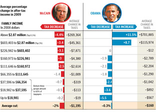
Just received a helpful note from Nelson Minar, who notes an already redrawn version of the graph from the last post over at Chartjunk. The redraw aims to improve the proportion between the different tax brackets:
Much better! Read more about their take, and associated caveats here. (Also thanks to Peter Merholz and Andrew Otwell who also wrote, yet were no match for Nelson’s swift fingers.)
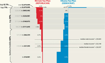
Finally, the infographic I’ve been waiting for, the Washington Post compares the tax proposals of United States presidential candidates John McCain and Barack Obama:
Lots of words have been spilled over the complexities of tax policy, whether in stump speeches, advertisements, or policy papers. But these are usually distilled for voters in lengthy articles that throw more words at the problem. But compare even a well-written article like this one at Business Week versus the graphic above from the Washington Post. Which of the two will you be able to remember tomorrow?
I also appreciate that the graphic very clearly represents the general tax policies of Republicans vs. Democrats, without showing bias toward either. The only thing that’s missing is a sense of how big each of the categories are – how many people are in the “over $2.87 million” category versus how many are in the “$66,000 to $112,000” category, which would help convey a better sense of the “middle class” term that candidates like to throw around.
There is still greater complexity to the debate than what’s shown in this image (the Business Week article describes treasury shortfalls based on the McCain proposal, for instance), but without the initial explanation provided by that graphic, will voters even bother with those details?
As the .com shakeout loomed in the late 90s, I always assumed that:
- Most internet-born companies would disappear.
- Traditional (brick & mortar) stores would eventually get their act together and have (or outsource) a proper online presence. For instance Barnes & Noble hobbling toward a usable site, and Borders just giving up and turning over their online presence to Amazon. The former comical, the latter brilliant, though Borders has just returned with their own non-Amazonian presence. (Though I think the humor is now gone from watching old-school companies trying to move online.)
- Finally, a few new names—namely the biggest ones, like Amazon—would be left that didn’t disappear with the others from point #1.
Basically, that not much would change. A couple new brands would emerge, but that there wasn’t really room in people’s heads for that many new retailers or services. (It probably didn’t help that all their logos were blue and orange, and had names like Flooz, Boo and Kibu that feel natural on the tongue and inspire buyer loyalty and confidence.)
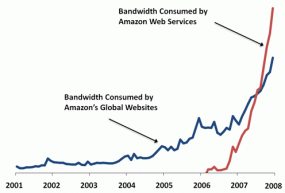 But not only did more companies stick around, some seem to be successfully pivoting into other areas. From Amazon:
In January of 2008 we announced that the Amazon Web Services now consume more bandwidth than do the entire global network of Amazon.com retail sites.
This from a blog post with this plot of the bandwidth use for both sides of the business.
Did you imagine that the site where you could buy books cheaper than anywhere else in 1998 would ten years later exceed the bandwidth from that with services for data storage and cloud computing? Of course, this announcement doesn’t say anything about their profits at this point, but I don’t think anyone expected Steve Jobs to turn Apple into a toy factory and start turning out music players and cell phones to have it become half their business within just a few years. (That’s half as in, “beastly silver PCs and shiny black and white laptops seem important and all, but those take real work…why bother?”)
But the point (aside from subjecting you to a long-winded description of .com history and my shortcomings as a futurist) has more to do with Amazon becoming a business that’s dealing purely in information. The information economy is all about people moving bits and ideas around (abstractions of things), instead of silk, furs, and spices (actual physical things). And while books are information, the growth of Amazon’s data services business—as evidenced by that graph—is one of the strongest indicators I’ve seen of just how real the non-real information economy has become. Not that the information economy is something new; but that the groundwork has been laid in the preceding decades where something like Amazon Web Services can be successful.
And since we’re on the subject of Amazon, I’ll close with more from Jeff Bezos from “How the Web Was Won” in this month’s Vanity Fair:
When we launched, we launched with over a million titles. There were countless snags. One of my friends figured out that you could order a negative quantity of books. And we would credit your credit card and then, I guess, wait for you to deliver the books to us. We fixed that one very quickly.
Or showing his genius early on:
When we started out, we were packing on our hands and knees on these cement floors. One of the software engineers that I was packing next to was saying, You know, this is really killing my knees and my back. And I said to this person, I just had a great idea. We should get kneepads. And he looked at me like I was from Mars. And he said, Jeff, we should get packing tables.
Thanks to Eugene for passing along the links.

