The New York Times today looks upon the plight of poor AT&T, saddled with millions of new customers paying thousands of dollars a year. Jenna Wortham writes:
Slim and sleek as it is, the iPhone is really the Hummer of cellphones. It’s a data guzzler. Owners use them like minicomputers, which they are, and use them a lot. Not only do iPhone owners download applications, stream music and videos and browse the Web at higher rates than the average smartphone user, but the average iPhone owner can also use 10 times the network capacity used by the average smartphone user.
If that 10x number didn’t come from AT&T, where did it come from? Seems like they might be starting a “we didn’t want the iPhone anyway” campaign so that investors treat them more nicely when they (are rumored to) lose their carrier exclusivity next year.
The result is dropped calls, spotty service, delayed text and voice messages and glacial download speeds as AT&T’s cellular network strains to meet the demand. Another result is outraged customers.
So even with AT&T’s outrageous prices, they can’t make this work? This week I’m canceling my AT&T service because it would cost $150 a month to get what T-Mobile charges me $80 for. (Two lines with shared minutes, texting on both lines, unlimited data on one, and even tethering. I also love T-Mobile’s customer service, staffed by friendly humans who don’t just read from scripts.)
With nine million users paying in excess of $100 a month apiece, they’re grossing a billion dollars a month, and they’re complaining about having to upgrade their network? They could probably fund rebuilding their entire network from scratch with the $15/month they charge to send more than 200 text messages. (Text messages are pure profit, because they’re sent using extra space in packets sent between the phone and the carrier.)
All of the cited problems, of course, would be lessened without carrier exclusivity. Don’t want 9 million iPhone customers clogging the network? Then don’t sign a deal requiring that you’re the only network they have access to. Hilarious.
But! The real reason I’m posting is because of the photos that accompany the article, including a shot of the AT&T command center and its big board:
A few thoughts:
If they’re gonna make it look like an orchestra pit, then I hope the head of IT is wearing tails.
Do they get night & weekend minutes because the lights are out? Wouldn’t the staff be a little happier if the lights were turned on?
And most important, I wonder what kind of coverage they get in there. It looks like the kind of underground bunker where you can’t get any signal. And if I’m not mistaken, those look like land lines on the desks.
Passed along by Jane Nisselson, a photo she found in the New Yorker, apropos of my continued fascination with command centers and the selection of information they highlight:
I think it was those clocks and choice of cities that were memorable. It is actually One Police plaza and not the terrorism HQ on Coney Island. The photographer is Eugene Richards.
For New Yorker readers, the original article is here.
Casey wrote with more info regarding the previous post about Pelham. The command center in the movie is fake (as expected), because the real command center looks too sophisticated. NPR had this quote from John Johnson (spelling?), New York City Transit’s Chief Transportation Officer:
“They actually … attempted to downplay what the existing control center looks like, because they wanted to make it look real to the average eye as compared to… we’re pretty Star Trekky up in the new control center now.”
So that would explain the newish typeface used in the image, and the general dumbing-down of the display. The audio from the NPR story is here, with the quote near the 3:00 mark.
This is the only image I’ve been able to find of the real command center:
Links to larger/better/more descriptive images welcome!
Is this a real place? Buried within the bowels of New York City? And Mr. Washington, how about using one of your two telephones to order a new typeface for that wall? Looks like a hundred thousand dollars of display technology being used for ASCII line art.
Saudi Aramco was originally an American company. It goes way back to the 1930s when two American geologists from Standard Oil of California discovered oil in the Saudi desert.
Standard Oil formed a consortium with Texaco, Exxon and Mobil, which became Aramco. It wasn’t until the 1980s that Saudi Arabia bought them out and nationalized the company. Today, Saudi Aramco is the custodian of the country’s sole source of wealth and power.
Over 16,000 people work at the company’s massive compound, which is like a little country with its own security force, schools, hospitals, and even its own airline.
According to Abdallah Jum’ah, Saudi Aramco’s president and CEO, Aramco is the world’s largest oil producing company.
And it’s the richest company in the world, worth, according to the latest estimate, $781 billion.
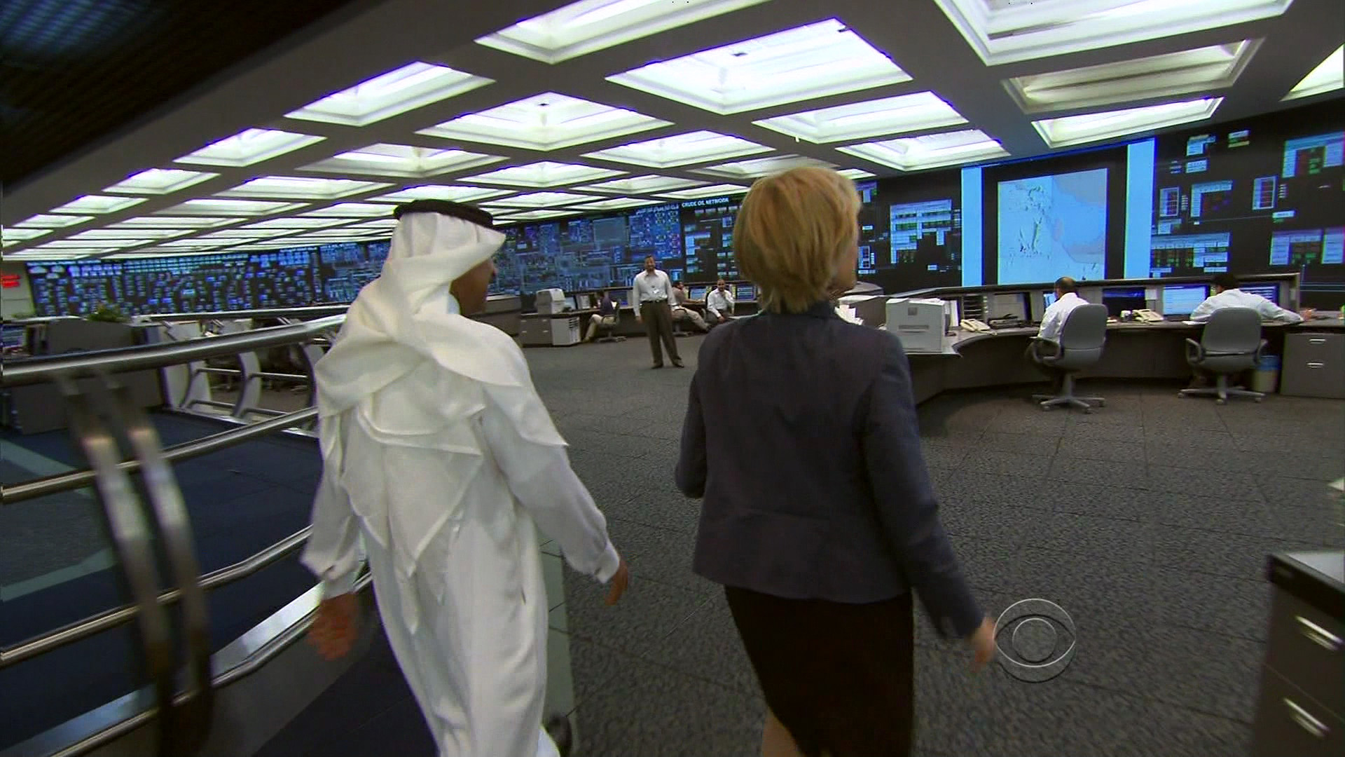
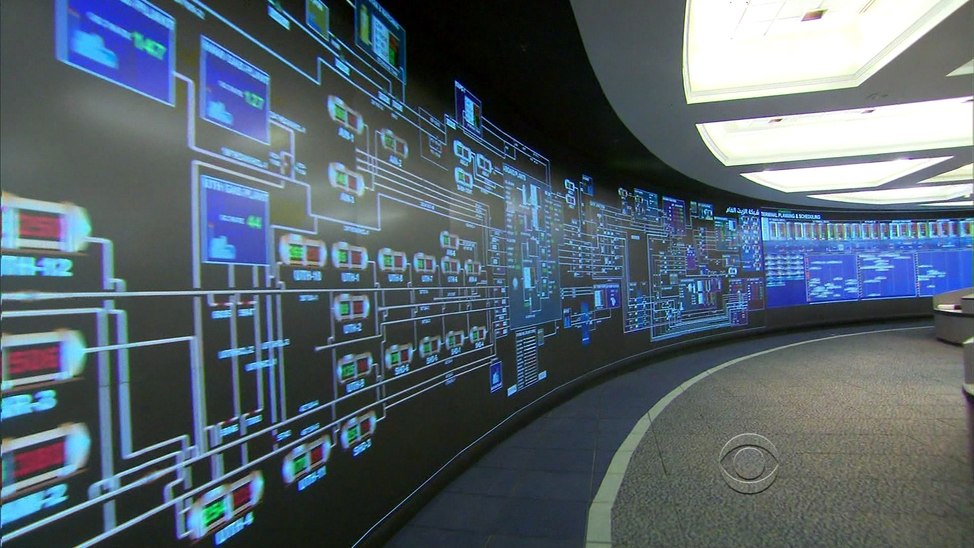
I was about to change the channel (perhaps as you were just about to stop reading this post), when they showed the big board:
Jum’ah gave 60 Minutes a tour of the company’s command center, where engineers scrutinize and analyze every aspect of the company’s operations on a 220-foot digital screen.
“Every facility in the kingdom, every drop of oil that comes from the ground is monitored in real time in this room,” Jum’ah explained. “And we have control of each and every facility, each and every pipeline, each and every valve on the pipeline. And therefore, we know exactly what is happening in the system from A to Z.”
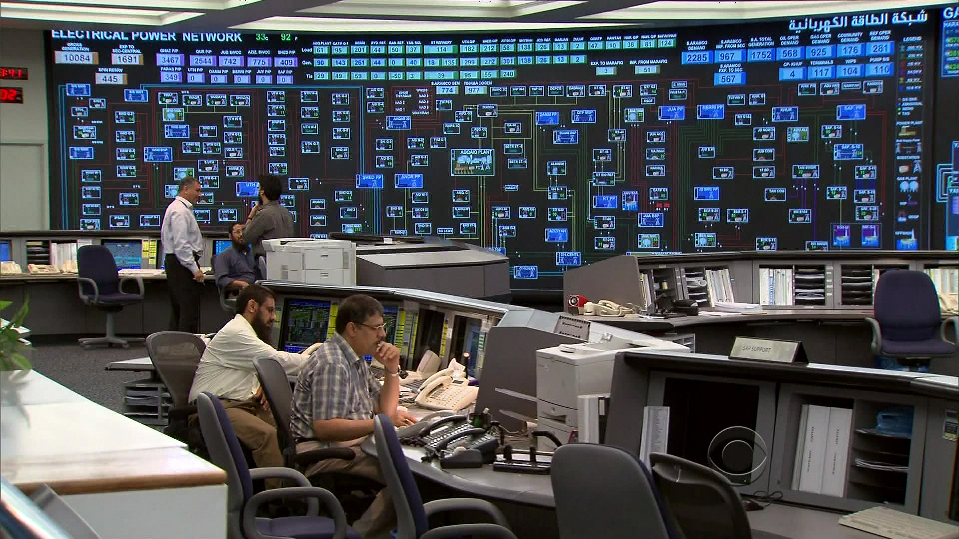
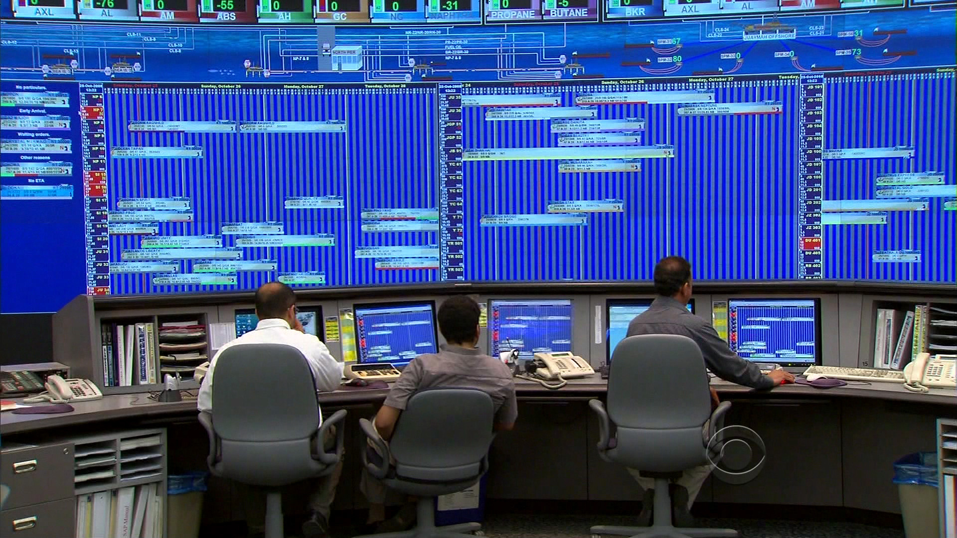
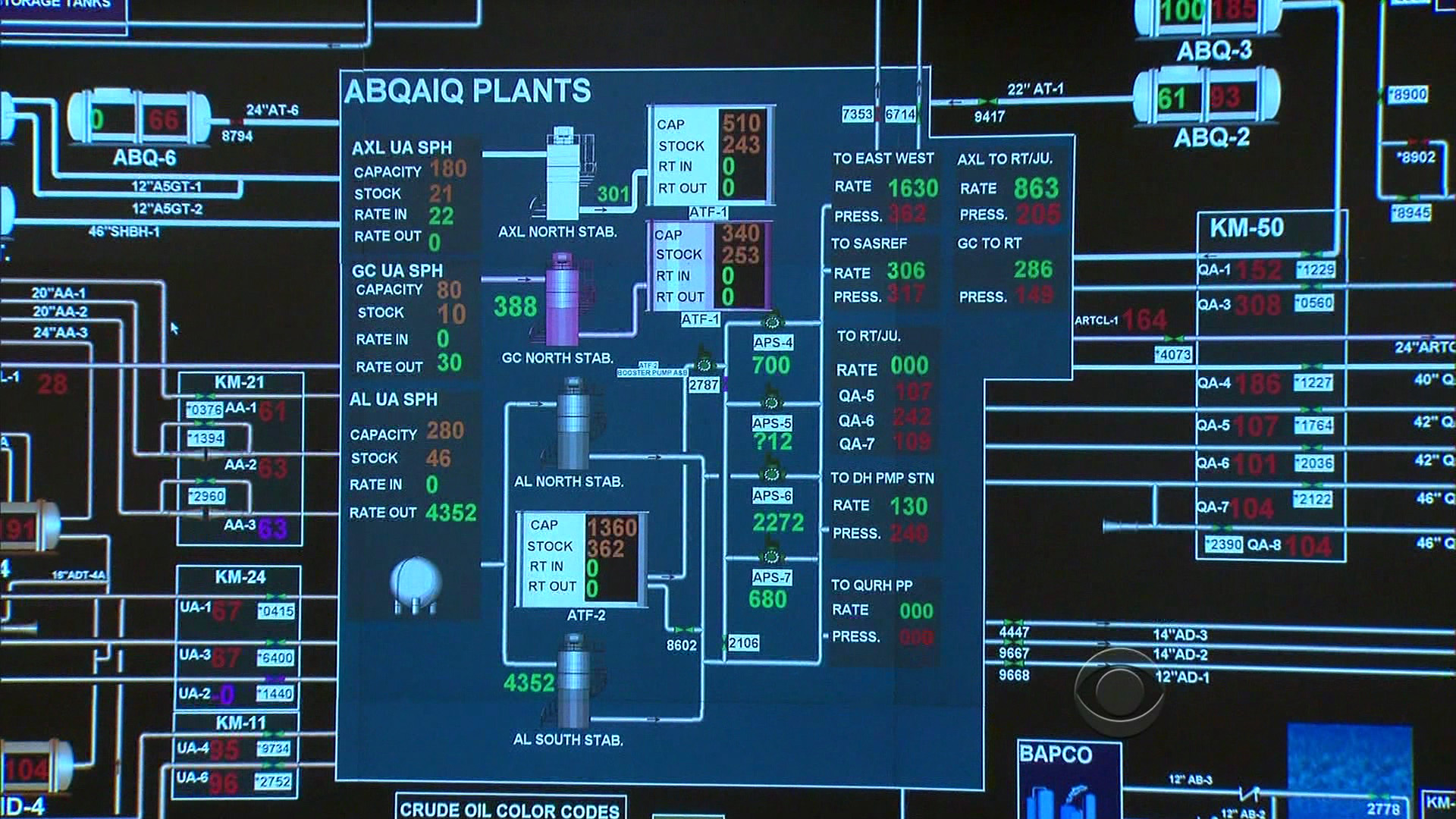
A large map shows all the oil fields in Saudi Arabia, including Ghawar, the largest on-shore oil field in the world, and Safaniya, the largest off-shore oil field in the world; green squares on the map monitor supertankers on the high seas in real time.
Here’s a short part of the segment that shows the display:
Since the smaller video doesn’t do it justice, several still images follow, each linked to their Comcastic, artifact-ridden HD versions:
Did rooms like this first exist in the movies and compelled everyone to imitate?
New guys and interns have to sit in front of the wall of vibrating bright blues:
The display is ambient in the sense that nobody’s actually using the larger version to do real work (you can see relevant portions replicated on individuals’ monitors). It seems to serve as a means of knowing what everyone in the room is up to (or as a deterrent against firing up Solitaire — I’m looking at you Ahmad). But more importantly, it’s there for visitors, especially visitors with video cameras, and people who write about visualization and happened to catch a segment about their info palace since it immediately followed the Patriots-Seahawks game.
A detail of one of the displays bears this out — an overload of ALL CAPS SANS SERIF TYPE with the appropriately unattractive array reds and greens. This sort of thing always makes me curious about what such displays would look like if they were designed properly. Rather than blowing up low resolution monitors, what would it look like if it were designed for the actual space and viewing distance in which it’s used?
Visualizing Data is my 2007 book about computational information design. It covers the path from raw data to how we understand it, detailing how to begin with a set of numbers and produce images or software that lets you view and interact with information. When first published, it was the only book(s) for people who wanted to learn how to actually build a data visualization in code.
The text was published by O’Reilly in December 2007 and can be found at Amazon and elsewhere. Amazon also has an edition for the Kindle, for people who aren’t into the dead tree thing. (Proceeds from Amazon links found on this page are used to pay my web hosting bill.)
The book covers ideas found in my Ph.D. dissertation, which is the basis for Chapter 1. The next chapter is an extremely brief introduction to Processing, which is used for the examples. Next is (chapter 3) is a simple mapping project to place data points on a map of the United States. Of course, the idea is not that lots of people want to visualize data for each of 50 states. Instead, it’s a jumping off point for learning how to lay out data spatially.
The chapters that follow cover six more projects, such as salary vs. performance (Chapter 5), zipdecode (Chapter 6), followed by more advanced topics dealing with trees, treemaps, hierarchies, and recursion (Chapter 7), plus graphs and networks (Chapter 8).
This site is used for follow-up code and writing about related topics.