I’m often asked about sonification—instead of visualization, turning data into audio—but I’ve never pursued it because there are other things that I’m more curious about. The bigger issue is that I was concerned that audio would require even more of a trained ear than a visualization (according to some) requires a trained eye.
But now, Johannes Kreidler, with the help of Microsoft Songsmith, has proven me wrong:
Johannes, time to book your ticket to IEEE InfoVis.
My opinion of Songsmith is shifting — while it’s generally presented as a laughingstock, catastrophic failure, or if nothing else, a complete embarrassment (especially for its developers slash infomercial actors), it’s really caught the imagination of a lot of people who are creating new things, even if all of them subvert the original intent of the project. (Where the original intent was to… create a tool that would help write a jingle for glow in the dark towels?)
At any rate, I think it’s achieved another kind of success, and web memes aside, I’m curious to see what actual utility comes from derivatives of the project, now that the music idea is firmly planted in peoples’ heads.
And if you stopped the video halfway through because it got a little tedious, you missed some of the good bits toward the end.
(Thanks to Moiz Syed for the link.)
Scale is one of the most important themes in data visualization. In Monty Python’s The Meaning of Life, Eric Idle shares his perspective:
The lyrics:
Just remember that you’re standing on a planet that’s evolving
And revolving at nine hundred miles an hour,
That’s orbiting at nineteen miles a second, so it’s reckoned,
A sun that is the source of all our power.
The sun and you and me and all the stars that we can see
Are moving at a million miles a day
In an outer spiral arm, at forty thousand miles an hour,
Of the galaxy we call the ‘Milky Way’.
Our galaxy itself contains a hundred billion stars.
It’s a hundred thousand light years side to side.
It bulges in the middle, sixteen thousand light years thick,
But out by us, it’s just three thousand light years wide.
We’re thirty thousand light years from galactic central point.
We go ’round every two hundred million years,
And our galaxy is only one of millions of billions
In this amazing and expanding universe.
The universe itself keeps on expanding and expanding
In all of the directions it can whizz
As fast as it can go, at the speed of light, you know,
Twelve million miles a minute, and that’s the fastest speed there is.
So remember, when you’re feeling very small and insecure,
How amazingly unlikely is your birth,
And pray that there’s intelligent life somewhere up in space,
‘Cause there’s bugger all down here on Earth. 
Someday I want to write like Ludacris, but for now I’ll enjoy info graphics of his work. Luda not only knows a lot of young ladies, but can proudly recite the range of area codes in which they live. Geographer (and feminist) Stefanie Gray took it upon herself to make a map:
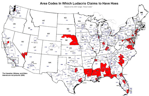
You’ll need background music while taking a look; and I found a quick refresher of the lyrics also informative. More discussion and highlights of her findings can be found on Strange Maps, who first published Stefanie’s image.
In related news, someone else has figured out Rick Astley:

I’ve added the album cover at left so that you can look into his eyes and see his honest face for yourself. If you’re not a proud survivor of the 80s (or perhaps if you are), the single can be had for a mere 99¢. Or if that only gets you started, you can pick up his Greatest Hits. Someone also made another version of the graphic using the Google chart API (mentioned earlier), though it appears less analytically sound (accurate).
More from song charts at this earlier post.
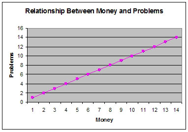 Given the number of data points provided, it would be difficult to refute the findings depicted in this chart.
Related work can be found here and here. While later research findings (by latecomers who foolishly claim to have invented the approach) here and here.
Thanks to Raelynn Miles for the original link.


