Learning from Lombardi
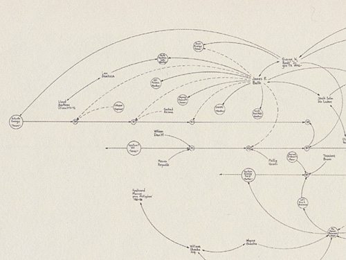
Just posted an essay about the work of artist Mark Lombardi that I presented at Experimenta Design in Lisbon last week. I don’t usually post lectures, but this is a kind of work-in-progress that I’m trying to sort out for myself.
For the panel, we were to choose “an individual, movement, technology, whatever – whose importance has been overlooked” and follow that with “two themes that [we] believe will define the future of design and architecture.” In that context, I chose Lombardi’s work, and how it highlights a number of themes that are important to the future of design, particularly in working with data.
15 Views of a Node Link Graph
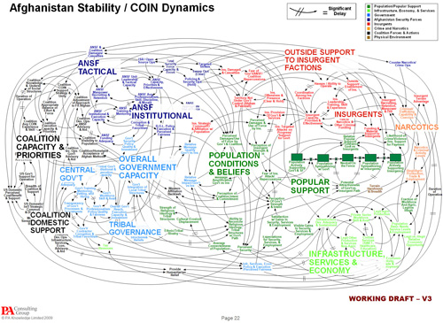
Depicting networks (also known as graphs, and covered in chapters 7 and 8 of Visualizing Data) is a tricky subject, and too often leads to representations that are a tangled and complicated mess. Such diagrams are often referred to with terms like ball of yarn or string, a birds nest, cat hair or simply hairball.
It’s also common for a network diagram to be engaging and attractive for its complexity (usually aided and abetted by color), which tends to hide how poorly it conveys the meaning of the data it represents.
On the other hand, Tamara Munzner is someone in visualization who really “gets” graphs in greater depth. A couple years ago she gave an excellent Google Tech Talk (looks like it was originally from another conference in ’05), titled “15 Views of a Node Link Graph” (video, links, slides) where she discussed a range of methods for working viewing graph data, along with their pros and cons:
A cheat sheet of the 15 methods:
- Edge List
- Hand-Drawn
- Dot
- Force-Directed Placement
- TopoLayout
- Animated Radial Layouts
- Constellation
- Treemaps
- Cushion Treemaps
- Themescapes
- Multilevel Call Matrices
- SpaceTree
- 2D Hyperbolic Trees
- H3
- TreeJuxtaposer
The presentation is an excellent survey of methods, and highly recommended for anyone getting started with graph and network data. It’s useful food for thought for the “how should I represent this data?” question.
 Visualizing Data is my 2007 book about computational information design. It covers the path from raw data to how we understand it, detailing how to begin with a set of numbers and produce images or software that lets you view and interact with information. When first published, it was the only book(s) for people who wanted to learn how to actually build a data visualization in code.
The text was published by O’Reilly in December 2007 and can be found at Amazon and elsewhere. Amazon also has an edition for the Kindle, for people who aren’t into the dead tree thing. (Proceeds from Amazon links found on this page are used to pay my web hosting bill.)
Examples for the book can be found here.
The book covers ideas found in my Ph.D. dissertation, which is the basis for Chapter 1. The next chapter is an extremely brief introduction to Processing, which is used for the examples. Next is (chapter 3) is a simple mapping project to place data points on a map of the United States. Of course, the idea is not that lots of people want to visualize data for each of 50 states. Instead, it’s a jumping off point for learning how to lay out data spatially.
The chapters that follow cover six more projects, such as salary vs. performance (Chapter 5), zipdecode (Chapter 6), followed by more advanced topics dealing with trees, treemaps, hierarchies, and recursion (Chapter 7), plus graphs and networks (Chapter 8).
This site is used for follow-up code and writing about related topics.
- Visualizing Data Examples
- On needing approval for what we create, and losing control over how it’s distributed
- Brains on the Line
- All Streets
- Watching the evolution of the “Origin of Species”
- The Earth at night
- Piet Mondrian Goes to the Super Bowl
- Sustainable Creativity at Pixar
- Surfing, Orgies, and Apple Pie
- Eric Idle on “Scale”
- New for 2010
- Are electronic medical records really about data?

