Are electronic medical records really about data?
Having spent my morning at the doctor’s office (I’m fine, Mom–just a physical), I passed the time by asking my doctor about the system they use for electronic medical records. Our GE work (1, 2) and seeing her gripe and sigh as truly awful-looking screen after screen flew past on her display caught my interest. And as someone who has an odd fascination with bad interfaces, I just had to ask…
Perhaps the most surprising bit was that without explicitly saying so, she seemed to find the EMR system most useful not as a thing that aggregates data, or makes her work easier, but instead as a communication tool. It combats the (very real, not just an overused joke) penmanship issues of fellow doctors, but equally as important, it sets a baseline or common framework for the details of a visit. The latter part is obvious, but the actual nature of it is more subtle. For instance, she would often find herself deciphering a scribble that says “throat, amox” by another doctor, and it says nothing of dosage, frequency, type of Amoxicillin, much less the nature of the throat trouble. A patient (particularly a sick patient) is also not the person to provide precise details. How many would remember whether they were assigned a 50, 150 or 500 milligram dosage (very different things, you might say). And for that matter, they’re probably equally likely to think they’re on a 500 kilogram dose. (“No, that’s too high. Must be 5 kilogram.”)
My doctor might be seeing such a patient because their primary care doctor (the mad scribbler) was out, or the patient was a referral, or had just moved offices, or whatever. But it makes an interesting point for the transience of medical data: importance increases as it’s in motion, which is especially true since the patient it’s attached to is not a static entity (from changing health conditions to changing jobs, cities, and doctors).
Or from a simpler angle, if you’re sick enough that you have to be seen by someone other than your primary care doctor, then it’s especially important for the information to be complete. So with any luck, the EMR removes a layer of translation that was required before.
As she described things off the top of her head, the data only came up later. Ok, it’s all data, but I’m referring to the numbers and the tests and the things that can be tracked easily over time. The sort of reduce-the-patient-to-numbers things we usually think of when hearing about EMRs. Readouts that display an array of tests, such as blood pressure history, is an important feature, but it wasn’t the killer app of EMRs. (And that will be the last time I use “killer app” and “electronic medical records” together. Pun not intended.)
The biggest downside (she’s now using her second system) is that the interfaces are terrible, usually that they do things in the wrong order, or require several windows and multiple clicks to do mundane tasks. She said there were several things that she liked and hated about this one, but that it was a completely different set of pros/cons from the other system she used. (And to over-analyze for a moment, I think she even said “like” and “hate” not “love” and “hate” or “like” and “dislike”. She also absentmindedly mentioned “this computer is going to kill me.” She’s not a whiner, and may truly believe it. EMRs may be killing our doctors! Call The New York Times, or at least Fox 25.) This isn’t surprising, I assume it’s just that technology purchasers are several levels removed from the doctors who have to use the equipment, which is usually the case for software systems like this, so there’s little market pressure for usability. If you’re big enough to need such a beast, then it means that the person making the decision about what to buy is a long ways removed. But I’m curious about whether this is a necessity of how big software is implemented, or a market opportunity.
At some point she also stated that it would be great if the software company had asked a doctor for their input in how the system was implemented. I think it’s safe to assume that there was at least one M.D.–if not an arsenal of individuals with a whole collection of alphabet soup trailing their names–who were involved with the software. But I was struck with how matter-of-fact she was that nobody had even thought about it. The software was that bad, and to her, the flaws were that obvious. The process by which she was forced to travel through the interface had little to do with the way she worked. Now, for any expert, they might have their own way of doing things, but that’s probably not the discrepancy here. (And in fact, if the differences between doctors are that great, then that itself should be part of the software: the doctor needs to be able to change the order in which the software works.) But it’s worth noting that the data (again, meaning the numbers and test history and easily measurable things) were all easily accessible from the interface, which suggests that like so many data-oriented projects, the numbers seduced the implementors. And so those concrete numbers (fourth or so on ranked importance for this doctor) won out over process (the way the doctor spends their day, and their time with the patient).
All of which is a long way of wondering, “are electronic medical records really about data?”
Go Greyhound, and leave the route-planning to us!
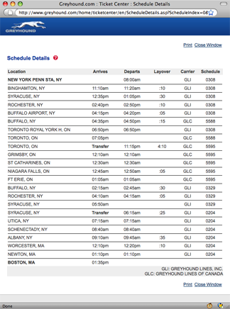
While checking the bus schedule for Greyhound, I recently discovered that travel from New York City to Boston is a multi-day affair, involving stops in Rochester, Toronto (yes, Canada), Fort Erie, Syracuse, and even Schenectady and Worcester (presumably because they’re both fun to say).

1 day, 5 hours, and 35 minutes. That’s the last time I complain about how bad the Amtrak site is.
Also from the office of scary flowcharts
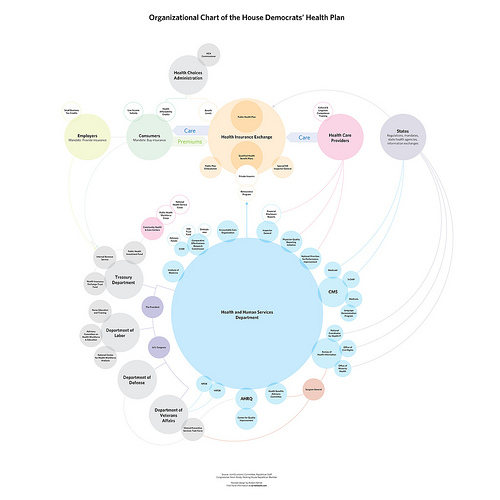
Responding to the Boehner post, Jay Parkinson, M.D. pointed me to this improved chart by designer Robert Palmer, accompanied by an angst-ridden open letter (an ironic contrast to the soft pastels in his diagram) decrying the crimes of visual malfeasance.
 Meanwhile, Ezra Klein over at the Washington Post seems to be thinking along similar lines as my original post, noting this masked artist’s earlier trip to Kinko’s a few weeks ago. Klein writes:
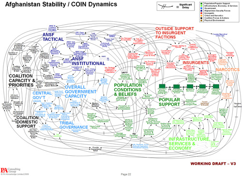
Whoever is heading the Scary Flowcharts Division of John Boehner’s office is quickly becoming my favorite person in Washington. A few weeks ago, we got this terror-inducing visualization of the process behind “Speaker Pelosi’s National Energy Tax.”
That’s hot!
If I were teaching right now, I’d make all my students do a one day charrette on trying to come up with something worse than the Boehner health care image while staying in the realm of colloquial things you can do with PowerPoint. It’d be a great time, and we’d all learn a lot.
Having spent two posts making fun of the whole un-funny mess around health care, I’ll leave you with the best bit of op-ed I’ve read on the topic, from Harold Meyerson, also at the Washington Post:
Watching the centrist Democrats in Congress create more and more reasons why health care can’t be fixed, I’ve been struck by a disquieting thought: Suppose our collective lack of response to Hurricane Katrina wasn’t exceptional but, rather, the new normal in America. Suppose we can no longer address the major challenges confronting the nation. Suppose America is now the world’s leading can’t-do country.
I agree and find it terrifying. And I don’t think that’s a partisan issue.
Now back to your purposefully apolitical, regularly scheduled blog on making pictures of data.
Mapping Health Care: Here Be Dragons!
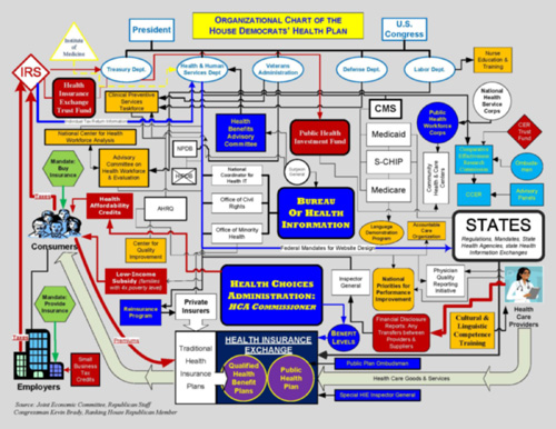
I’m so completely impressed with this incredible bit of info graphic awesomeness distributed by the office of John Boehner, Republican congressman from Ohio’s 8th District. The flow chart purports to show the Democrats’ health care proposal:

The image needs to be much larger to be fully appreciated in its magnificent glory of awfulness, so a high resolution version is here, and the PDF version is here.
The chart was used by Boehner as a way to make the plan look as awful as possible — a tactic used to great effect by the same political party during the last attempt at health care reform in 1994. The diagram appears to be the result of a heart-warming collaboration between a colorblind draughtsman, the architect of a nightmarish city water works, and whoever designed the instructions for the bargain shelving unit I bought from Target.
Don’t waste your time, by the way — I’ve already nominated it for an AIGA award.
(And yes, The New Republic also created a cleaner version, and the broader point is that health care is just a complex mess no matter what, so don’t let that get in the way of my enjoyment of this masterwork.)
Additional perspective from The Daily Show (my original source) follows.
 Visualizing Data is my 2007 book about computational information design. It covers the path from raw data to how we understand it, detailing how to begin with a set of numbers and produce images or software that lets you view and interact with information. When first published, it was the only book(s) for people who wanted to learn how to actually build a data visualization in code.
The text was published by O’Reilly in December 2007 and can be found at Amazon and elsewhere. Amazon also has an edition for the Kindle, for people who aren’t into the dead tree thing. (Proceeds from Amazon links found on this page are used to pay my web hosting bill.)
Examples for the book can be found here.
The book covers ideas found in my Ph.D. dissertation, which is the basis for Chapter 1. The next chapter is an extremely brief introduction to Processing, which is used for the examples. Next is (chapter 3) is a simple mapping project to place data points on a map of the United States. Of course, the idea is not that lots of people want to visualize data for each of 50 states. Instead, it’s a jumping off point for learning how to lay out data spatially.
The chapters that follow cover six more projects, such as salary vs. performance (Chapter 5), zipdecode (Chapter 6), followed by more advanced topics dealing with trees, treemaps, hierarchies, and recursion (Chapter 7), plus graphs and networks (Chapter 8).
This site is used for follow-up code and writing about related topics.
- Visualizing Data Examples
- On needing approval for what we create, and losing control over how it’s distributed
- Brains on the Line
- All Streets
- Watching the evolution of the “Origin of Species”
- The Earth at night
- Piet Mondrian Goes to the Super Bowl
- Sustainable Creativity at Pixar
- Surfing, Orgies, and Apple Pie
- Eric Idle on “Scale”
- New for 2010
- Are electronic medical records really about data?

