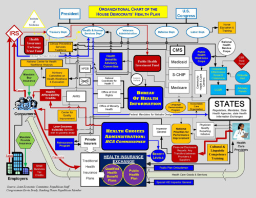
Also from the office of scary flowcharts
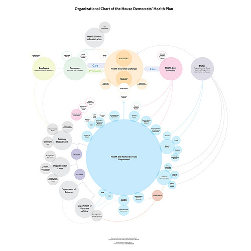
Responding to the Boehner post, Jay Parkinson, M.D. pointed me to this improved chart by designer Robert Palmer, accompanied by an angst-ridden open letter (an ironic contrast to the soft pastels in his diagram) decrying the crimes of visual malfeasance.
 Meanwhile, Ezra Klein over at the Washington Post seems to be thinking along similar lines as my original post, noting this masked artist’s earlier trip to Kinko’s a few weeks ago. Klein writes:
Whoever is heading the Scary Flowcharts Division of John Boehner’s office is quickly becoming my favorite person in Washington. A few weeks ago, we got this terror-inducing visualization of the process behind “Speaker Pelosi’s National Energy Tax.”
That’s hot!
If I were teaching right now, I’d make all my students do a one day charrette on trying to come up with something worse than the Boehner health care image while staying in the realm of colloquial things you can do with PowerPoint. It’d be a great time, and we’d all learn a lot.
Having spent two posts making fun of the whole un-funny mess around health care, I’ll leave you with the best bit of op-ed I’ve read on the topic, from Harold Meyerson, also at the Washington Post:
Watching the centrist Democrats in Congress create more and more reasons why health care can’t be fixed, I’ve been struck by a disquieting thought: Suppose our collective lack of response to Hurricane Katrina wasn’t exceptional but, rather, the new normal in America. Suppose we can no longer address the major challenges confronting the nation. Suppose America is now the world’s leading can’t-do country.
I agree and find it terrifying. And I don’t think that’s a partisan issue.
Now back to your purposefully apolitical, regularly scheduled blog on making pictures of data.


