Health Numbers in Context
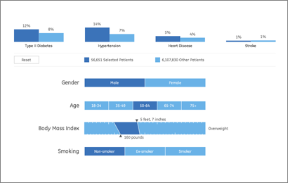
As a continuation of this project, we’ve just finished a second health visualization (also built with Processing) using GE’s data. Like the first round, we started with ~6 million patient records from their “MQIC” database. Using the software, you input gender, age range, height/weight (to calculate BMI), and smoking status. Based on the selections it shows you the number of people in the database that match those settings, and the percentages that have been diagnosed with diabetes, heart disease, hypertension, or have had a stroke:
For people reading the site because they’re interested in visualization (I guess that’s all of you, except for mom, who is just trying to figure out what I’m up to), some inside baseball:
On the interaction side, the main objective here was to make it easy to move around the interface as quickly as possible. The rows are shown in succession so that the interface can teach itself, but we also provide a reset button so that you can return to the starting point. Once the rows are visible, though, it’s easy to move laterally and make changes to the settings (swapping between age ranges, for instance).
One irony of making the data accessible this way is that most users — after looking up their own numbers — will then try as many different possibilities, in a quick hunt for the extremes. How high do the percentages go? If I select bizarre values, what happens at the edges? Normally, you don’t have to spend as much time on these 1% cases, and it would be alright for things to be a little weird when truly odd values are entered (300 lb. people who are 4′ tall, smokers, and age 75 and over). But in this case, a lot more time has to be spent making sure things work. So while most of the time the percentages at the top are in the 5-15% range, I had to write code so that when one category shoots up to 50%, the other bars in the chart scale down in proportion.
Another aspect of the interface is the body mass index calculator. Normally a BMI chart looks something like this, a large two-dimensional plot that would otherwise use up half of the interface. By using a little interaction, we can make a simpler chart that dynamically updates itself based on the current height or weight settings. Also, because the ranges have (mathematically) hard edges, we’re showing that upper and lower bound of the range so that it’s more apparent. Otherwise, a 5’8″ person steps from 164 to 165 lbs to find themselves suddenly overweight. In reality, the boundaries are more fuzzy, which would be taken into account by a doctor. But with the software, we instead have to be clear about the way the logic is working.
(Note that the height and weight are only used to calculate a BMI range — it’s not pulling individuals from the database who are 5’8″ and 160 lbs, it’s pulling people from the “normal” BMI range.)
For the statistically (or at least numerically) inclined, there are also some interesting quirks that can be found, like a situation or two where health risk would be expected to go up, but in fact they go down (I’ll leave you to find them yourself). This is not a bug. We’re not doing any sort of complex math here to evaluate actual risk, the software is just a matching game with individuals in the database. These cases in particular show up when there are only a few thousand individuals, say 2,000 out of the full 6 million records. The number of people in these edge cases is practically a rounding error, which means that we can’t make sound conclusions with them. As armchair doctor-scientist, it’s also interesting to speculate as to what might be happening in such cases, and how other factors may come into play.
Have fun!


