I love this image of a radio signal reading found on Futility Closet, mostly because it belongs in a movie:

As the post explains, this was a signal seen by astronomer Jerry Ehman, coming from Sagittarius in 1977, but never replicated.
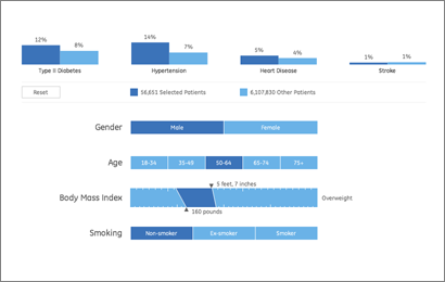
As a continuation of this project, we’ve just finished a second health visualization (also built with Processing) using GE’s data. Like the first round, we started with ~6 million patient records from their “MQIC” database. Using the software, you input gender, age range, height/weight (to calculate BMI), and smoking status. Based on the selections it shows you the number of people in the database that match those settings, and the percentages that have been diagnosed with diabetes, heart disease, hypertension, or have had a stroke:

For people reading the site because they’re interested in visualization (I guess that’s all of you, except for mom, who is just trying to figure out what I’m up to), some inside baseball:
On the interaction side, the main objective here was to make it easy to move around the interface as quickly as possible. The rows are shown in succession so that the interface can teach itself, but we also provide a reset button so that you can return to the starting point. Once the rows are visible, though, it’s easy to move laterally and make changes to the settings (swapping between age ranges, for instance).
One irony of making the data accessible this way is that most users — after looking up their own numbers — will then try as many different possibilities, in a quick hunt for the extremes. How high do the percentages go? If I select bizarre values, what happens at the edges? Normally, you don’t have to spend as much time on these 1% cases, and it would be alright for things to be a little weird when truly odd values are entered (300 lb. people who are 4′ tall, smokers, and age 75 and over). But in this case, a lot more time has to be spent making sure things work. So while most of the time the percentages at the top are in the 5-15% range, I had to write code so that when one category shoots up to 50%, the other bars in the chart scale down in proportion.
Another aspect of the interface is the body mass index calculator. Normally a BMI chart looks something like this, a large two-dimensional plot that would otherwise use up half of the interface. By using a little interaction, we can make a simpler chart that dynamically updates itself based on the current height or weight settings. Also, because the ranges have (mathematically) hard edges, we’re showing that upper and lower bound of the range so that it’s more apparent. Otherwise, a 5’8″ person steps from 164 to 165 lbs to find themselves suddenly overweight. In reality, the boundaries are more fuzzy, which would be taken into account by a doctor. But with the software, we instead have to be clear about the way the logic is working.
(Note that the height and weight are only used to calculate a BMI range — it’s not pulling individuals from the database who are 5’8″ and 160 lbs, it’s pulling people from the “normal” BMI range.)
For the statistically (or at least numerically) inclined, there are also some interesting quirks that can be found, like a situation or two where health risk would be expected to go up, but in fact they go down (I’ll leave you to find them yourself). This is not a bug. We’re not doing any sort of complex math here to evaluate actual risk, the software is just a matching game with individuals in the database. These cases in particular show up when there are only a few thousand individuals, say 2,000 out of the full 6 million records. The number of people in these edge cases is practically a rounding error, which means that we can’t make sound conclusions with them. As armchair doctor-scientist, it’s also interesting to speculate as to what might be happening in such cases, and how other factors may come into play.
Have fun!
 Article from the New York Times a bit ago, covering R, everyone’s favorite stats package:
R is also the name of a popular programming language used by a growing number of data analysts inside corporations and academia. It is becoming their lingua franca partly because data mining has entered a golden age, whether being used to set ad prices, find new drugs more quickly or fine-tune financial models. Companies as diverse as Google, Pfizer, Merck, Bank of America, the InterContinental Hotels Group and Shell use it.
R is also open source, another focus of the article, which includes quoted gems such as this one from commercial competitor SAS:
 “I think it addresses a niche market for high-end data analysts that want free, readily available code,” said Anne H. Milley, director of technology product marketing at SAS. She adds, “We have customers who build engines for aircraft. I am happy they are not using freeware when I get on a jet.”
Pure gold: free software is scary software! And freeware? Is she trying to conflate R with free software downloads from CNET?
Truth be told, I don’t think I’d want to be on a plane that used a jet engine designed or built with SAS (or even R, for that matter). Does she know what her product does? (A hint: It’s a statistics package. You might analyze the engine with it, but you don’t use it for design or construction.)
For those less familiar with the project, some examples:
…companies like Google and Pfizer say they use the software for just about anything they can. Google, for example, taps R for help understanding trends in ad pricing and for illuminating patterns in the search data it collects. Pfizer has created customized packages for R to let its scientists manipulate their own data during nonclinical drug studies rather than send the information off to a statistician.
At any rate, many congratulations to Robert Gentleman and Ross Ihaka, the original creators, for their success. It’s a wonderful thing that they’re making enough of a rumpus that a stats package is being covered in a mainstream newspaper.
Arrrr!
I was fascinated a few weeks ago to receive this email from the Genome-announce list at UCSC:
Last week the National Institutes of Health (NIH) modified their policy for posting and accessing genome-wide association studies (GWAS) data contained in NIH databases. They have removed public access to aggregate genotype GWAS data in response to the publication of new statistical techniques for analyzing dense genomic information that make it possible to infer the group assignment (case vs. control) of an individual DNA sample under certain circumstances. The Wellcome Trust Case Control Consortium in the UK and the Broad Institute of MIT and Harvard in Boston have also removed aggregate data from public availability. Consequently, UCSC has removed the “NIMH Bipolar” and “Wellcome Trust Case Control Consortium” data sets from our Genome Browser site.
The ingredients for a genome-wide association study are a few hundred people, and a list of what genetic letter (A, C, G, or T) is found at a few hundred specific locations in the DNA of each of those people. Such data is then correlated to whether individuals have a particular disease, and using the correlation, it’s possible to sometimes localize what part of the genome is responsible for the disease.
Of course, the diseases might be of a sensitive nature (e.g. bipolar disorder), so when such data is made publicly available, it’s done in a manner that protects the privacy of the individuals in the data set. What this message means is that a bioinformatics method has been developed that undermines those privacy protections. An amazing bit of statistics!
This made me curious about what led to such a result, so with a little digging, I found this press release, which describes the work:
A team of investigators led by scientists at the Translational Genomics Research Institute (TGen) have found a way to identify possible suspects at crime scenes using only a small amount of DNA, even if it is mixed with hundreds of other genetic fingerprints.
Using genotyping microarrays, the scientists were able to identify an individual’s DNA from within a mix of DNA samples, even if that individual represented less than 0.1 percent of the total mix, or less than one part per thousand. They were able to do this even when the mix of DNA included more than 200 individual DNA samples.
The discovery could help police investigators better identify possible suspects, even when dozens of people over time have been at a crime scene. It also could help reassess previous crime scene evidence, and it could have other uses in various genetic studies and in statistical analysis.
So the CSI folks have screwed it up for the bipolar folks. The titillatingly-titled “Resolving Individuals Contributing Trace Amounts of DNA to Highly Complex Mixtures Using High-Density SNP Genotyping Microarrays” can be found at PLoS Genetics, and a PDF describing the the policy changes is on the NIH’s site for Genome-Wide Association Studies. The PDF provides a much more thorough explanation of what association studies are, in case you’re looking for something better than my cartoon version described above.
Links to much more coverage can be found here, which includes major journals (Nature) and mainstream media outlets (LA Times, Financial Times) weighing in on the research. (It’s always funny to see how news outlets respond to this sort of thing—the Financial Times talk about the positive side, the LA Times focuses exclusively on the negative.) A discussion about the implications of the study can also be found on the PLoS site, with further background from the study’s primary author.
Science presents such fascinating contradictions. A potentially helpful advance that undermines another area of research. The breakthrough that opens a Pandora’s Box. It’s probably rare to see such a direct contradiction (that’s not heavily politicized like, say, stem cell research), but the social and societal impact is undoubtedly one of the things I love most about genetics in particular.
 BusinessWeek has an excerpt of Numerati, a book about the fabled monks of data mining (publishers weekly calls them “entrepreneurial mathematicians”) who are sifting through the personal data we create every day.
Picture an IBM manager who gets an assignment to send a team of five to set up a call center in Manila. She sits down at the computer and fills out a form. It’s almost like booking a vacation online. She puts in the dates and clicks on menus to describe the job and the skills needed. Perhaps she stipulates the ideal budget range. The results come back, recommending a particular team. All the skills are represented. Maybe three of the five people have a history of working together smoothly. They all have passports and live near airports with direct flights to Manila. One of them even speaks Tagalog.
Everything looks fine, except for one line that’s highlighted in red. The budget. It’s $40,000 over! The manager sees that the computer architect on the team is a veritable luminary, a guy who gets written up in the trade press. Sure, he’s a 98.7% fit for the job, but he costs $1,000 an hour. It’s as if she shopped for a weekend getaway in Paris and wound up with a penthouse suite at the Ritz.
Hmmm. The manager asks the system for a cheaper architect. New options come back. One is a new 29-year-old consultant based in India who costs only $85 per hour. That would certainly patch the hole in the budget. Unfortunately, he’s only a 69% fit for the job. Still, he can handle it, according to the computer, if he gets two weeks of training. Can the job be delayed?
This is management in a world run by Numerati.
I’m highly skeptical of management (a fundamentally human activity) being distilled to numbers in this manner. Unless, of course, the managers are that poor at doing their job. And further, what’s the point of the manager if they’re spending most of their time filling out the vacation form-style work order? (Filling out tedious year-end reviews, no doubt.) Perhaps it should be an indication that the company is simply too large:
As IBM sees it, the company has little choice. The workforce is too big, the world too vast and complicated for managers to get a grip on their workers the old-fashioned way—by talking to people who know people who know people.
Then we descend (ascend?) into the rah-rah of today’s global economy:
Word of mouth is too foggy and slow for the global economy. Personal connections are too constricted. Managers need the zip of automation to unearth a consultant in New Delhi, just the way a generation ago they located a shipment of condensers in Chicago. For this to work, the consultant—just like the condensers—must be represented as a series of numbers.
I say rah-rah because how else can you put refrigeration equipment parts in the same sentence as a living, breathing person with a mind, free will and a life.
And while I don’t think I agree with this particular thesis, the book as a whole looks like an interesting survey of efforts in this area. Time to finish my backlog of Summer reading so I can order more books…
 Derek Jeter vs. Objective Reality is an entertaining article from Slate regarding a study by Shane T. Jensen at the Wharton School. Nate DiMeo writes:
The take-away from the study, which was presented at the annual meeting of the American Association for the Advancement of Science, was that Mr. Jeter (despite his three Gold Gloves and balletic leaping throws) is the worst-fielding shortstop in the game.
The New York press was unhappy, but the stats-minded baseball types (Sabermetricians) weren’t that impressed. DiMeo continues:
Mostly, though, the paper didn’t provoke much intrigue because Jeter’s badness is already an axiom of [Sabermetric literature]. In fact, debunking the conventional wisdom about the Yankee captain’s fielding prowess has become a standard method of proving the validity of a new fielding statistic. That places Derek Jeter at the frontier of new baseball research.
Well put. Mr. Jeter defended himself by saying:
“Maybe it was a computer glitch”
What I like about the article, aside from a objective and quantitative reason to dislike Jeter (I already have a quantity of subjective reasons) is how the article frames the issue in the broader sports statistics debate. It nicely covers this new piece of information as a microcosm of the struggle between sabermetricians and traditional baseball types, while essentially poking fun at both: the total refusal of the traditional side to buy into the numbers, and the schadenfreude of the geeks going after Jeter since he’s the one who gets the girls. (The article is thankfully not as trite as that, but you get the idea.)
I’m also biased since the metric in the paper places Pokey Reese, one of my favorite Red Sox players of 2004 as #11 amongst second basemen between 2000-2005.
And of course, The Onion does it better:
Experts: ‘Derek Jeter Probably Didn’t Need To Jump To Throw That Guy Out’
BRISTOL, CT—Baseball experts agreed Sunday that Derek Jeter, who fielded a routine ground ball during a regular-season game in which the Yankees were leading by five runs and then threw it to first base using one of his signature leaps, did not have to do that to record the out. “If it had been a hard-hit grounder in the hole or even a slow dribbler he had to charge, that would’ve been one thing,” analyst John Kruk said during a broadcast of Baseball Tonight. “But when it’s hit right to him by [Devil Rays first-baseman] Greg Norton, a guy who has no stolen bases and is still suffering the effects of a hamstring injury sustained earlier this year… Well, that’s a different story.” Jeter threw out Norton by 15 feet and pumped his fist in celebration at the end of the play.
In other news, I can’t believe I just put a picture of Jeter on my site.
Some thoughtful comments passed along by Alex Hutton regarding the last post:
Part of the problem with point technology solutions is in the policies of implementation. IMHO, we undervalue the subject matter expert, or operate as a denigrated bureaucracy which does not allow the subject matter expert the flexibility to make decisions. When that happens, the decision is left to technology (and as you point out, no technology is a perfect decision maker).
I thought it was apropos that you brought in the Schneier example. I’ve been very much involved in a parallel thought process in the same industry as he, and we (my partner and I) are coming to a solution that attempts to balance technology, point human decision, and the bureaucracy within which they operate.
If you believe the Bayesians, then the right Bayesian network mimics the way the brain processes qualitative information to create a belief (or in the terms of Bayesians, a probability statement used to make a decision). As such, the current way we use the technology (that policy of implementation, above) is faulty because it minimizes that “Human Computational Engine” for a relatively unsophisticated, unthinking technology. That’s not to say that technologies like facial recognition are worthless – computational engines, even less magic ones that aren’t 99.99% accurate, are valid pieces of prior information (data).
Now in the same way, Human Computational Engines are also less than perfectly accurate. In fact, they are not at all guaranteed to work the same way twice – even by the same person unless that person is using framework to provide rigor, rationality, and consistency in analysis.
So ideally, in physical security (or information security where Schneier and I come from) the imperfect computer detection engine is combined with a good Bayesian network and well trained/educated/experienced subject matter experts to create a more accurate probability statement around terrorist/non-terrorist – one that at least is better at identifying cases where more information is needed before a person is prevented from flying, searched and detained. While this method, too, would not be 100% infallible (no solution will ever be), it would create a more accurate means of detection by utilizing the best of the human computational engine.
I believe the Bayesians, just 99.99% of the time.


 Article from the New York Times

 Derek Jeter vs. Objective Reality