Writing

Taking the “vs.” out of Man & Machine

Fascinating editorial from chess champion Gary Kasparov, about the relationship between humans and machines:

The AI crowd, too, was pleased with the result and the attention, but dismayed by the fact that Deep Blue was hardly what their predecessors had imagined decades earlier when they dreamed of creating a machine to defeat the world chess champion. Instead of a computer that thought and played chess like a human, with human creativity and intuition, they got one that played like a machine, systematically evaluating 200 million possible moves on the chess board per second and winning with brute number-crunching force. As Igor Aleksander, a British AI and neural networks pioneer, explained in his 2000 book, How to Build a Mind:

By the mid-1990s the number of people with some experience of using computers was many orders of magnitude greater than in the 1960s. In the Kasparov defeat they recognized that here was a great triumph for programmers, but not one that may compete with the human intelligence that helps us to lead our lives.

It was an impressive achievement, of course, and a human achievement by the members of the IBM team, but Deep Blue was only intelligent the way your programmable alarm clock is intelligent. Not that losing to a $10 million alarm clock made me feel any better.

He continues to describe playing games with humans aided by computers, and how it made the game even more dependent upon creativity:

Having a computer program available during play was as disturbing as it was exciting. And being able to access a database of a few million games meant that we didn’t have to strain our memories nearly as much in the opening, whose possibilities have been thoroughly catalogued over the years. But since we both had equal access to the same database, the advantage still came down to creating a new idea at some point.

Or some of the other effects:

Having a computer partner also meant never having to worry about making a tactical blunder. The computer could project the consequences of each move we considered, pointing out possible outcomes and countermoves we might otherwise have missed. With that taken care of for us, we could concentrate on strategic planning instead of spending so much time on calculations. Human creativity was even more paramount under these conditions. Despite access to the “best of both worlds,” my games with Topalov were far from perfect. We were playing on the clock and had little time to consult with our silicon assistants. Still, the results were notable. A month earlier I had defeated the Bulgarian in a match of “regular” rapid chess 4–0. Our advanced chess match ended in a 3–3 draw. My advantage in calculating tactics had been nullified by the machine.

The final reinforces that I’d heard others describe Kasparov’s play as machine-like in the past (in a sense, this is verification or even quantification of that idea). It also includes some interesting comments on numerical scale:

The number of legal chess positions is 1040, the number of different possible games, 10120. Authors have attempted various ways to convey this immensity, usually based on one of the few fields to regularly employ such exponents, astronomy. In his book Chess Metaphors, Diego Rasskin-Gutman points out that a player looking eight moves ahead is already presented with as many possible games as there are stars in the galaxy. Another staple, a variation of which is also used by Rasskin-Gutman, is to say there are more possible chess games than the number of atoms in the universe. All of these comparisons impress upon the casual observer why brute-force computer calculation can’t solve this ancient board game. They are also handy, and I am not above doing this myself, for impressing people with how complicated chess is, if only in a largely irrelevant mathematical way.

And one last statement:

Our best minds have gone into financial engineering instead of real engineering, with catastrophic results for both sectors.

In the article, Kasparov mentions Moravec’s Paradox, described by Wikipedia as:

“contrary to traditional assumptions, the uniquely human faculty of reason (conscious, intelligent, rational thought) requires very little computation, but that the unconscious sensorimotor skills and instincts that we share with the animals require enormous computational resources”

And another interesting notion:

Marvin Minsky emphasizes that the most difficult human skills to reverse engineer are those that are unconscious. “In general, we’re least aware of what our minds do best,” he writes, and adds “we’re more aware of simple processes that don’t work well than of complex ones that work flawlessly.”

Saturday, February 20, 2010 | human, scale, simulation  

Mediocre metrics, and how did we get here?

In other news, an article from Slate about measuring obesity using BMI (Body Mass Index). Interesting reading as I continue with work in the health care space. The article goes through the obvious flaws of the BMI measure, along with some history. Jeremy Singer-Vine writes:

Belgian polymath Adolphe Quetelet devised the equation in 1832 in his quest to define the “normal man” in terms of everything from his average arm strength to the age at which he marries. This project had nothing to do with obesity-related diseases, nor even with obesity itself. Rather, Quetelet used the equation to describe the standard proportions of the human build—the ratio of weight to height in the average adult. Using data collected from several hundred countrymen, he found that weight varied not in direct proportion to height (such that, say, people 10 percent taller than average were 10 percent heavier, too) but in proportion to the square of height. (People 10 percent taller than average tended to be about 21 percent heavier.)

For some reason, this brings to mind a guy in a top hat guessing peoples’ weight at the county fair. More to the point is the “how did we get here?” part of the story. Starting with a mediocre measure, it evolved into something for which it was never intended, simply because it worked for a large number of individuals:

The new measure caught on among researchers who had previously relied on slower and more expensive measures of body fat or on the broad categories (underweight, ideal weight, and overweight) identified by the insurance companies. The cheap and easy BMI test allowed them to plan and execute ambitious new studies involving hundreds of thousands of participants and to go back through troves of historical height and weight data and estimate levels of obesity in previous decades.

Gradually, though, the popularity of BMI spread from epidemiologists who used it for studies of population health to doctors who wanted a quick way to measure body fat in individual patients. By 1985, the NIH started defining obesity according to body mass index, on the theory that official cutoffs could be used by doctors to warn patients who were at especially high risk for obesity-related illness. At first, the thresholds were established at the 85th percentile of BMI for each sex: 27.8 for men and 27.3 for women. (Those numbers now represent something more like the 50th percentile for Americans.) Then, in 1998, the NIH changed the rules: They consolidated the threshold for men and women, even though the relationship between BMI and body fat is different for each sex, and added another category, “overweight.” The new cutoffs—25 for overweight, 30 for obesity—were nice, round numbers that could be easily remembered by doctors and patients.

I hadn’t realized that it was only 1985 that this came into common use. And I thought the new cutoffs had more to do with the stricter definition from the WHO, rather than the simplicity of rounding. But back to the story:

Keys had never intended for the BMI to be used in this way. His original paper warned against using the body mass index for individual diagnoses, since the equation ignores variables like a patient’s gender or age, which affect how BMI relates to health.

After taking as fact that it was a poor indicator, all this grousing about the inaccuracy of BMI now has me wondering how often it’s actually out of whack. For instance, it does poorly for muscular athletes, but what percentage of the population is that? 10% at the absolute highest? Or at the risk of sounding totally naive, if the metric is correct, say, 85% of the time, does it deserve as much derision as it receives?

Going a little further, another fascinating part of returns to the fact that the BMI numbers had in the past been a sort of guideline used by doctors. Consider the context: a doctor might sit with a patient in their office, and if the person is obviously not obese or underweight, not even consider such a measure. But if there’s any question, BMI provides a general clue as to an appropriate range, which, when delivered by a doctor with experience, can be framed appropriately. However, as we move to using technology to record such measures—it’s easy to put an obesity calculation into an electronic medical record, for instance, that EMR does not (necessarily) include the doctor’s delivery.

Basically, we can make a general rule or goal that numbers that require additional context (delivery by a doctor), shouldn’t be stored in places devoid of context (databases). If we’re taking away context, the accuracy of the metric has to increase in proportion (or proportion squared, even) to the amount of context that has been removed.

I assume this is the case for most fields, and that the statistical field has a term (probably made up by Tukey) for the “remove context, increase accuracy” issue. At any rate, that’s the end of today’s episode of “what’s blindingly obvious to proper statisticians but I like working out for myself.”

Tuesday, July 21, 2009 | human, numberscantdothat  

Curiosity Kills Privacy

There’s simply no way to give people access to others’ private records — in the name of security or otherwise — and trust those given access to do the right thing. From a New York Times story on the NSA’s expanded wiretapping:

The former analyst added that his instructors had warned against committing any abuses, telling his class that another analyst had been investigated because he had improperly accessed the personal e-mail of former President Bill Clinton.

This is not isolated, and this will always be the case. From a story in The Boston Globe a month ago:

Law enforcement personnel looked up personal information on Patriots star Tom Brady 968 times – seeking anything from his driver’s license photo and home address, to whether he had purchased a gun – and auditors discovered “repeated searches and queries” on dozens of other celebrities such as Matt Damon, James Taylor, Celtics star Paul Pierce, and Red Sox owner John Henry, said two state officials familiar with the audit.

The NSA wiretapping is treated too much like an abstract operation, with most articles that describe it overloaded with talk of “data collection,” and “monitoring,” and the massive scale of data that traffics through internet service providers. But the problem isn’t the computers and data and equipment, it’s that on the other end of the line, a human being is sitting there deciding what to do with that information. Our curiosity and voyeurism leaves us fundamentally flawed for dealing with such information, and unable to ever live up to the responsibility of having that access.

The story about the police officers who are overly curious about sports stars (or soft rock balladeers) is no different from the NSA wiretapping, because it’s still people, with the same impulses, on the other end of the line. Until reading this, I had wanted to believe that NSA employees — who should truly understand the ramifications — would have been more professional. But instead they’ve proven themselves no different from a local cop who wants to know if Paul Pierce owns a gun or Matt Damon has a goofy driver’s license picture.

Friday, June 19, 2009 | human, privacy, security  

Handcrafted Data

1219473416_8507.jpgContinuing Luddite Monday, a new special feature on benfry.com, an article from the Boston Globe about the prevalence of handcrafted images in reference texts. Dushko Petrovich writes:

But in fact, nearly two centuries after the publication of his famous folios, it is Audubon’s technique, and not the sharp eye of the modern camera, that prevails in a wide variety of reference books. For bird-watchers, the best guides, the most coveted guides – like those by David Allen Sibley and Roger Tory Peterson – are still filled with hand-painted images. The same is true for similar volumes on fish, trees, and even the human body. Ask any first-year medical student what they consult during dissections, and they will name Dr. Frank H. Netter’s meticulously drafted “Atlas of Human Anatomy.” Or ask architects and carpenters to see their structures, and they will often show you chalk and pencil “renderings,” even after the things have been built and professionally photographed.

This nicely reinforces the case for drawing, and why it’s so powerful. The article later gets to the meat of the issue, which is the same reason that drawing is a topic on a site about data visualization.

Besides seamlessly imposing a hierarchy of information, the handmade image is also free to present its subject from the most efficient viewpoint. Audubon sets a high standard in this regard; he is often at pains to depict the beak in its most revealing profile, the crucial feathers at an identifiable angle, the front leg extended just so. When the nighthawk and the whip-poor-will are pictured in full flight, their legs tucked away, he draws the feet at the side of the page, so we’re not left guessing. If Audubon draws a bird in profile, as he does with the pitch-black rook and the grayer hooded crow, we’re not missing any details a three-quarters view would have shown.

And finally, a reminder:

Confronted with unprecedented quantities of data, we are constantly reminded that quality is what really matters. At a certain point, the quality and even usefulness of information starts being defined not by the precision and voracity of technology, but by the accuracy and circumspection of art. Seen in this context, Audubon shows us that painting is not just an old fashioned medium: it is a discipline that can serve as a very useful filter, collecting, editing, and carefully synthesizing information into a single efficient and evocative image – giving us the information that we really want, information we can use and, as is the case with Audubon, even cherish.

Consider this your constant reminder, because I think it’s actually quite rare that quality is acknowledged. I regularly attend lectures by speakers who boast about how much data they’ve collected and the complexity of their software and hardware, but it’s one in ten thousand who even mention the art of removing or ignoring data in search of better quality.

Looks like the Early Drawings book mentioned in the article will be available at the end of September.

Monday, September 1, 2008 | drawing, human, refine  

Skills as Numbers

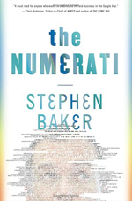
numerati-small.jpgBusinessWeek has an excerpt of Numerati, a book about the fabled monks of data mining (publishers weekly calls them “entrepreneurial mathematicians”) who are sifting through the personal data we create every day.

Picture an IBM manager who gets an assignment to send a team of five to set up a call center in Manila. She sits down at the computer and fills out a form. It’s almost like booking a vacation online. She puts in the dates and clicks on menus to describe the job and the skills needed. Perhaps she stipulates the ideal budget range. The results come back, recommending a particular team. All the skills are represented. Maybe three of the five people have a history of working together smoothly. They all have passports and live near airports with direct flights to Manila. One of them even speaks Tagalog.

Everything looks fine, except for one line that’s highlighted in red. The budget. It’s $40,000 over! The manager sees that the computer architect on the team is a veritable luminary, a guy who gets written up in the trade press. Sure, he’s a 98.7% fit for the job, but he costs $1,000 an hour. It’s as if she shopped for a weekend getaway in Paris and wound up with a penthouse suite at the Ritz.

Hmmm. The manager asks the system for a cheaper architect. New options come back. One is a new 29-year-old consultant based in India who costs only $85 per hour. That would certainly patch the hole in the budget. Unfortunately, he’s only a 69% fit for the job. Still, he can handle it, according to the computer, if he gets two weeks of training. Can the job be delayed?

This is management in a world run by Numerati.

I’m highly skeptical of management (a fundamentally human activity) being distilled to numbers in this manner. Unless, of course, the managers are that poor at doing their job. And further, what’s the point of the manager if they’re spending most of their time filling out the vacation form-style work order? (Filling out tedious year-end reviews, no doubt.) Perhaps it should be an indication that the company is simply too large:

As IBM sees it, the company has little choice. The workforce is too big, the world too vast and complicated for managers to get a grip on their workers the old-fashioned way—by talking to people who know people who know people.

Then we descend (ascend?) into the rah-rah of today’s global economy:

Word of mouth is too foggy and slow for the global economy. Personal connections are too constricted. Managers need the zip of automation to unearth a consultant in New Delhi, just the way a generation ago they located a shipment of condensers in Chicago. For this to work, the consultant—just like the condensers—must be represented as a series of numbers.

I say rah-rah because how else can you put refrigeration equipment parts in the same sentence as a living, breathing person with a mind, free will and a life.

And while I don’t think I agree with this particular thesis, the book as a whole looks like an interesting survey of efforts in this area. Time to finish my backlog of Summer reading so I can order more books…

Monday, September 1, 2008 | human, mine, notafuturist, numberscantdothat, privacy, social  

Human Computation (or “Mechanical Turk” meets “Family Feud”)

richard_dawson.jpgComputers are really good at repetitive work. You can ask a computer to multiply two numbers together seven billion times and not only will it not complain, it’ll probably have seven billion answers for you a few seconds later. Ask a person to do the same thing and they’ll either walk away at the outset, realizing the ridiculousness of the task, or they’ll get through the first few tries and lose interest. But even the fact that a human can recognize the ridiculousness of the task is important. Humans are good at lots of things—like identifying a face in a crowd—that cannot be addressed by computation with the same level of accuracy.

Visualization is about the interface between what humans are good at, and what computers are good at. First, the computer can crunch all seven billion numbers, then present the results in a way that we can use our own perceptual skills to identify what’s important or interesting. (This is also why the design of a visualization is a fundamentally human task, and not something to be left to automation.)

This is also the subject of Luis von Ahn’s work at Carnegie Mellon. You’re probably familiar with CAPTCHA images—usually wavy numbers and letters that you have to discern when signing up for a webmail account or buying tickets from Ticketmaster. The acronym stands for “Completely Automated Public Turing Test to Tell Computers and Humans Apart,” a clever mouthful referring to Alan Turing’s work in discerning man or machine. (I encourage you to read about them, but this is already getting long so I won’t get into it here.)

More interesting than CAPTCHA, however, is the whole notion that’s behind it: that it’s an example of relying on humans to do what they’re best at, though it’s a task that’s difficult for computers. (Sure, in recent weeks, people have actually found ways to “break” CAPTCHAs in specific cases, but that’s not important here.) For instance, the work was extended to the Google Image Labeler, described as follows:

You’ll be randomly paired with a partner who’s online and using the feature. Over a two-minute period, you and your partner will:

  • View the same set of images.
  • Provide as many labels as possible to describe each image you see.
  • Receive points when your label matches your partner’s label. The number of points will depend on how specific your label is.
  • See more images until time runs out.

Prior to this, most image labeling systems had to do with getting volunteers to name or tag images individually. As you can imagine, the quality of tags suffer considerably because of everything from differences in how people perceive or describe what they see, to individuals who try to be a little too clever in choosing tags. With the Image Labeler game, that’s turned around backwards, where there is a motivation to use tags that match the other person, thus minimizing the previous problems. (It’s “Mechanical Turk” meets “Family Feud”.) They’ve also applied the same ideas to scanning books—where fragments of text that cannot be recognized by software are instead checked by multiple people.

More recently, von Ahn’s group has expanded these ideas in Games With A Purpose, a site that addresses these “casual games” more directly. The new site is covered in this New Scientist article, which offers additional tidbits (perspective? background? couldn’t think of the right word).

You can also watch Luis’ Google Tech Talk about Human Computation, which if I’m not mistaken, led to the Image Labeler project.

(We met Luis a couple times while at CMU and watched the Superbowl with his awesome fiancée Laura, cheering on her hometown Chicago Bears against those villainous Colts. We were happy when he received a MacArthur Fellowship for his work—just the sort of person you’d like to get such an award that highlights people who often don’t quite fit in their field.)

Mommy can we play infringing on my civil liberties?Returning to the earlier argument, algorithms to identify a face in a crowd are certainly improving. But without a significant breakthrough, their usefulness will be significantly limited. One commonly hyped use for such systems is airport security. Bruce Schneier explains the problem:

Suppose this magically effective face-recognition software is 99.99 percent accurate. That is, if someone is a terrorist, there is a 99.99 percent chance that the software indicates “terrorist,” and if someone is not a terrorist, there is a 99.99 percent chance that the software indicates “non-terrorist.” Assume that one in ten million flyers, on average, is a terrorist. Is the software any good?

No. The software will generate 1000 false alarms for every one real terrorist. And every false alarm still means that all the security people go through all of their security procedures. Because the population of non-terrorists is so much larger than the number of terrorists, the test is useless. This result is counterintuitive and surprising, but it is correct. The false alarms in this kind of system render it mostly useless. It’s “The Boy Who Cried Wolf” increased 1000-fold.

Given the number of travelers at Boston Logan in 2006, that would be two “terrorists” identified per day. (And with Schneier’s one in ten million is a terrorist figure, that would be two or three terrorists per year…clearly too generous, which makes the face detection accuracy even worse than how he describes it.) I find myself thinking about the 99.99% accuracy number as I stare at the back of heads lined up at the airport security checkpoint—itself a human problem, not a computational problem.

Thursday, May 15, 2008 | cs, games, human, perception, security  
Book

Visualizing Data Book CoverVisualizing Data is my 2007 book about computational information design. It covers the path from raw data to how we understand it, detailing how to begin with a set of numbers and produce images or software that lets you view and interact with information. When first published, it was the only book(s) for people who wanted to learn how to actually build a data visualization in code.

The text was published by O’Reilly in December 2007 and can be found at Amazon and elsewhere. Amazon also has an edition for the Kindle, for people who aren’t into the dead tree thing. (Proceeds from Amazon links found on this page are used to pay my web hosting bill.)

Examples for the book can be found here.

The book covers ideas found in my Ph.D. dissertation, which is the basis for Chapter 1. The next chapter is an extremely brief introduction to Processing, which is used for the examples. Next is (chapter 3) is a simple mapping project to place data points on a map of the United States. Of course, the idea is not that lots of people want to visualize data for each of 50 states. Instead, it’s a jumping off point for learning how to lay out data spatially.

The chapters that follow cover six more projects, such as salary vs. performance (Chapter 5), zipdecode (Chapter 6), followed by more advanced topics dealing with trees, treemaps, hierarchies, and recursion (Chapter 7), plus graphs and networks (Chapter 8).

This site is used for follow-up code and writing about related topics.