Allie Brosh, who appears to be some sort of genius, brings us definitive arguments in the cake versus pie debate. Best to read the entire treatise, but here are a few highlights on how clearly pie defeats cake:
Ability of enjoyment to be sustained over time
Couldn’t agree more: it always seems like a good idea on the first bite, and then I catch myself. What am I doing? I hate cake. Another graphic:
Unequal frosting distribution is a problem
I grew up requesting pie for my birthday (strawberry rhubarb, thank you very much) instead of cake. This resonates. More importantly (for this site), Brosh cites the enormous impact of pie vs. cake for information design and visualization:
Depicting networks (also known as graphs, and covered in chapters 7 and 8 of Visualizing Data) is a tricky subject, and too often leads to representations that are a tangled and complicated mess. Such diagrams are often referred to with terms like ball of yarn or string, a birds nest, cat hair or simply hairball.
It’s also common for a network diagram to be engaging and attractive for its complexity (usually aided and abetted by color), which tends to hide how poorly it conveys the meaning of the data it represents.
On the other hand, Tamara Munzner is someone in visualization who really “gets” graphs in greater depth. A couple years ago she gave an excellent Google Tech Talk (looks like it was originally from another conference in ’05), titled “15 Views of a Node Link Graph” (video, links, slides) where she discussed a range of methods for working viewing graph data, along with their pros and cons:
A cheat sheet of the 15 methods:
Edge List
Hand-Drawn
Dot
Force-Directed Placement
TopoLayout
Animated Radial Layouts
Constellation
Treemaps
Cushion Treemaps
Themescapes
Multilevel Call Matrices
SpaceTree
2D Hyperbolic Trees
H3
TreeJuxtaposer
The presentation is an excellent survey of methods, and highly recommended for anyone getting started with graph and network data. It’s useful food for thought for the “how should I represent this data?” question.
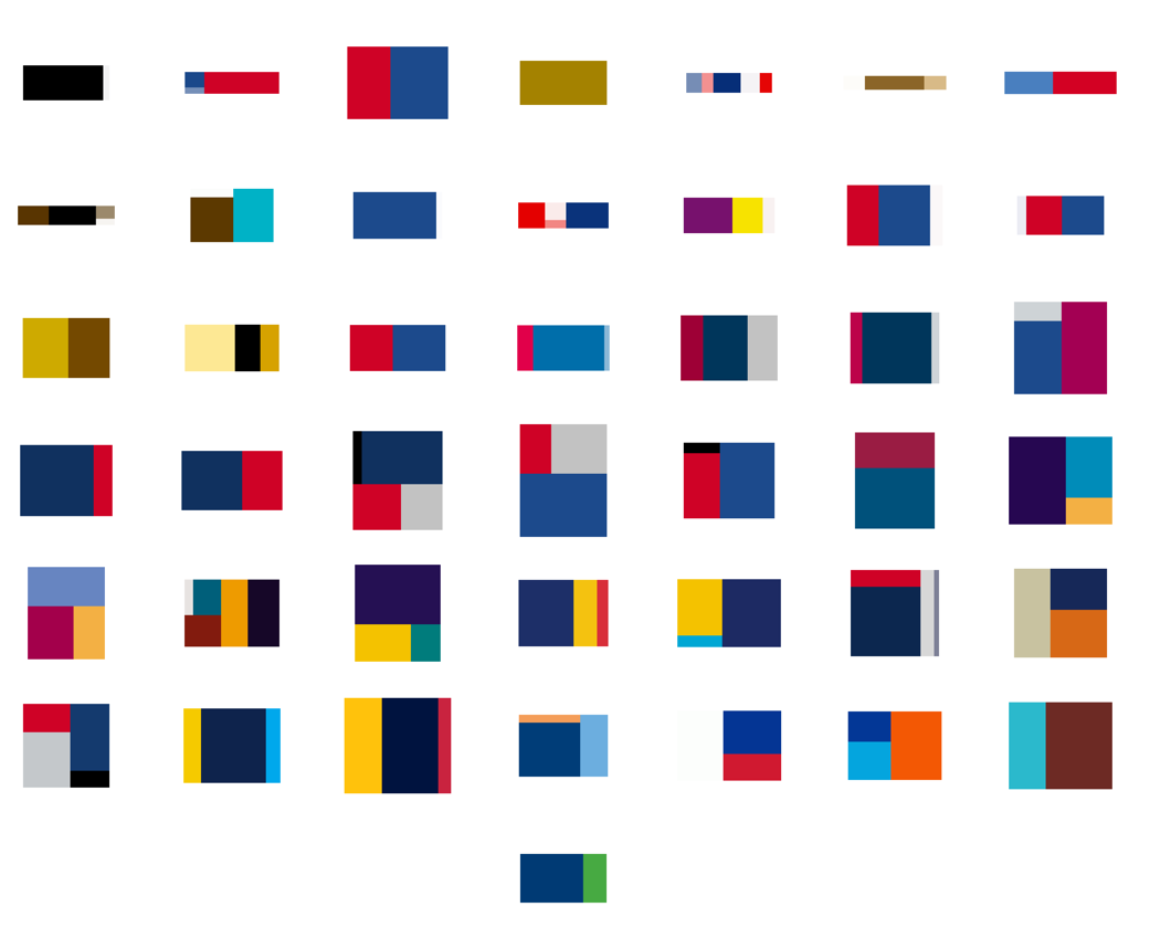
Beneath a pile of 1099s, I found myself distracted still thinking about the logo colors and proportions seen in the previous post. This led to a diversion to extract the colors from the Super Bowl logos and depict them according to their usage. The colors are counted up and laid out using a Treemap.
The result for all 43 Super Bowl logos, using the same layout as the previous image:
A few of the typical pairs, starting with 2001:
See all of the pairings here. Some notes about what’s mildly clever, and the less so:
The empty space (white areas or transparent background) is subtracted from the logo, and the code tries to size the Treemap according to the aspect ratio of the original image, so that when seen adjacent the logo, things look balanced (kinda).
The code is a simple adaptation of the Treemap project in Chapter 7 of Visualizing Data.
Unfortunately, I could not find vector images (for all of the games, at least), which means the colors in the original images are not pure. For instance, edges of a solid blue color will have light blue edges because of smoothing (anti-aliasing). This makes it difficult to accurately figure out what’s a real color and what isn’t. Sometimes the fuzzy edge colors are correctly removed, other times not so much. Even worse, it may even remove legitimate colors that are used in less than 4-5% of the image.
The color quantization isn’t good. On a few, it’s bad, and causes a few similar colors to disappear.
All the above could be fixed, but taxes are more important than non-representational art. (That’s not a blanket statement — just for me this evening.)
And finally, I don’t honestly think there’s any relationship between a software algorithm for data visualization and the work of an artist like Piet Mondrian. But I do love the idea of a Dutch painter from the De Stijl movement making his way through the turnstiles at Raymond Jones Stadium.
…also known as Bluff, though they call it “Beautiful Graphs in JavaScript.” And who can argue with pink?
Bluff is a JavaScript port of the Gruff graphing library for Ruby. It is designed to support all the features of Gruff with minimal dependencies; the only third-party scripts you need to run it are a copy of JS.Class (about 2kb gzipped) and a copy of Google’s ExCanvas to support canvas in Internet Explorer. Both these scripts are supplied with the Bluff download. Bluff itself is around 8kb gzipped.
There’s something cool (and hilarious) about the fact that even though we’re talking about bleeding edge features (decent JavaScript and Canvas support) only available in the most recent of modern browser releases, the criteria of awesomeness and usefulness is still the same as 1997 — that it’s only 8 Kb.
(The only thing that strikes me as odd, strictly from an interface perspective, is the fact that I can’t drag the “image” to the Desktop, the way that I would a JPEG or GIF image. Certainly that’s also the case for Flash and Java, but there’s something that strikes me as strange the way that JavaScript is so lightweight — part of the browser — yet the thing isn’t really “there”.)
At any rate, I’m fairly fascinated by this idea of JavaScript being a useful client-side means of generating images. Something very exciting is bound to happen.
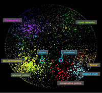
In contrast to the conventional wisdom that Iranian bloggers are mainly young democrats critical of the regime, we found a wide range of opinions representing religious conservative points of view as well as secular and reform-minded ones, and topics ranging from politics and human rights to poetry, religion, and pop culture. Our research indicates that the Persian blogosphere is indeed a large discussion space of approximately 60,000 routinely updated blogs featuring a rich and varied mix of bloggers.
In addition to identifying four major poles (Secular/Reformist, Conservative/Religious, Persian Poetry and Literature, and Mixed Networks.) A number of surprising findings include details like the nature of discourse (such as the prominence of the poetry and literature category) or issues of anonymity:
…a minority of bloggers in the secular/reformist pole appear to blog anonymously, even in the more politically-oriented part of it; instead, it is more common for bloggers in the religious/conservative pole to blog anonymously. Blocking of blogs by the government is less pervasive than we had assumed.
They also produced images to represent the nature of the networks, seen in the thumbnail at right. The visualization is created with a force-directed layout that iteratively groups data points closer based on their content. It’s useful for this kind of study, where the intent is to represent or identify larger groups. In this case, the graphic supports what’s laid out in the text, but to me the most interesting thing about the study is the human-centered tasks of the project, such as the work done by hand in reviewing and categorizing such a large number of sites. It’s this background work that sets it apart from many other images like it which tend to rely too heavily on automation.
(The paper is from April 6, 2008 and I first heard about after being contacted by John in June. Around 1999, our group had hosted students that he was teaching in a summer session for a visit to the Media Lab. And now a few months later, I’m digging through my writing todo pile.)
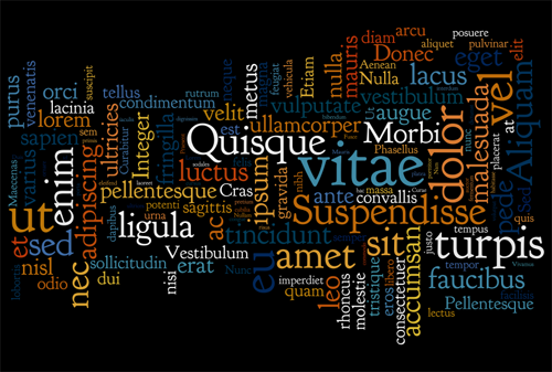
I’ve never really been fond of tag clouds, but Wordle, by MacGyver of software (and former drummer for They Might Be Giants) Jonathan Feinberg gives the representation an aesthetic nudge lacking in most representations. The application creates word clouds from input data submitted by users. I was reminded of it yesterday by Eugene, who submitted Lorem Ipsum:
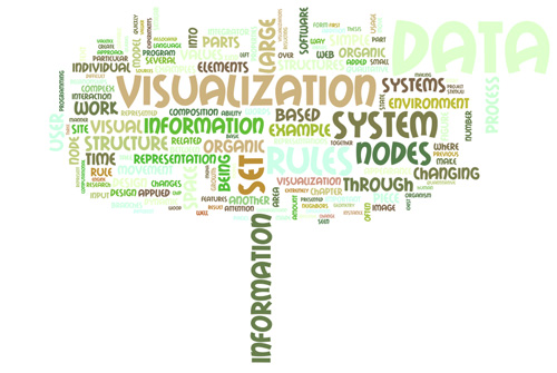
I had first heard about it from emailer Bill Robertson, who had uploaded Organic Information Design, my master’s thesis. (Which was initially flattering but quickly became terrifying when I remembered that it still badly needs a cleanup edit.)
A wonderful tree shape! Can’t decide which I like better: “information” as the stem or “data” as a cancerous growth in the upper-right.
Mr. Feinberg is also the reason that Processing development has been moving to Eclipse (replacing emacs, some shell scripts, two packages of bazooka bubble gum and the command line) because of his donation of a long afternoon helping set up the software in the IDE back when I lived in East Cambridge, just a few blocks from where he works at IBM Research.
It’s April again, which means that there are messages lurking in my inbox asking about the whereabouts of this year’s Salary vs. Performance project (found in Chapter 5 of the good book). I got around to updating it a few days ago, which means now my inbox has changed to suggestions on how the piece might be improved. (It’s tempting to say, “Hey! Check out the book and the code, you can do anything you’d like with it! It’s more fun that way.” but that’s not really what they’re looking for.)
One of the best messages I’ve received so far is from someone who I strongly suspect is a statistician, who was wishing to see a scatter plot of the data rather than its current representation. Who else would be pining for a scatterplot? There are lots of jokes about the statistically inclined that might cover this situation, but… we’re much too high minded to let things devolve to that (actually, it’s more of a pot-kettle-black situation). If prompted, statisticians usually tell better jokes about themselves anyways.
At any rate, as it’s relevant to the issue of how you choose representations, my response follows:
Sadly, the scatter plot of the same data is actually kinda uninformative, since one of your axes (salary) is more or less fixed all season (might change at the trade deadline, but more or less stays fixed) and it’s just the averages that move about. So in fact if we’re looking for more “accurate”, a time series is gonna be better for our purposes. In an actual analytic piece, for instance, I’d do something very different (which would include multiple years, more detail about the salaries and how they amortize over time, etc).
But even so, making the piece more “correct” misses the intentional simplifications found in it, e.g. it doesn’t matter whether a baseball team was 5% away from winning, it only matters whether they’ve won. At the end of the day, it’s all about the specific rankings, who gets into the playoffs, and who wins those final games. Since the piece isn’t intended as an analytical tool, but something that conveys the idea of salary vs. performance to an audience who by and large cares little about 1) baseball and 2) stats. That’s not to say that it’s about making something zoomy and pretty (and irrelevant), but rather, how do you engage people with the data in a way that teaches them something in the end and gets them thinking about it.
Now to get back to my inbox and the guy who would rather have the data sonified since he thinks this visual thing is just a fad.
I’ve not had a chance to try these out with an actual project yet, but the Google Chart API seems to be a decent way to get Tufte® compliant chart images using simple web requests. Just pack the info for the chart’s appearance and data into a specially crafted URL and you’re set.
It’s a nice idea for a service, and I also appreciate that Google has kept it simple, rather than implementing it through a series of obfuscated and strangely-crafted embedded JavaScript (like, say, Google maps or their newer search APIs after discontinuing the SOAP protocol).
Visualizing Data is my 2007 book about computational information design. It covers the path from raw data to how we understand it, detailing how to begin with a set of numbers and produce images or software that lets you view and interact with information. When first published, it was the only book(s) for people who wanted to learn how to actually build a data visualization in code.
The text was published by O’Reilly in December 2007 and can be found at Amazon and elsewhere. Amazon also has an edition for the Kindle, for people who aren’t into the dead tree thing. (Proceeds from Amazon links found on this page are used to pay my web hosting bill.)
The book covers ideas found in my Ph.D. dissertation, which is the basis for Chapter 1. The next chapter is an extremely brief introduction to Processing, which is used for the examples. Next is (chapter 3) is a simple mapping project to place data points on a map of the United States. Of course, the idea is not that lots of people want to visualize data for each of 50 states. Instead, it’s a jumping off point for learning how to lay out data spatially.
The chapters that follow cover six more projects, such as salary vs. performance (Chapter 5), zipdecode (Chapter 6), followed by more advanced topics dealing with trees, treemaps, hierarchies, and recursion (Chapter 7), plus graphs and networks (Chapter 8).
This site is used for follow-up code and writing about related topics.